From what I understood from my research is that morphology is all about systems, analyses, and deconstruction.
System: each topic has a specific language, structure and way of being studies and explored; which creates its own system. Some systems are more recognizable and clearer than others.
Analyses: Some systems are interpreted in different ways. Some have more distribution than others, but all are being analyzed in their own unique way.
Deconstruction: Parts of the structure / system are labeled in different parts and components. This is because some things could be broken down to different parts and elements to understand and see it in a macro/micro form.
Systems I find interesting
idea #1 Portrait Drawing Rules
When we first start drawing portraits, there are specific guidelines and rules we should follow to be able to come out with a successful drawing. Even though all portraits are different from each other, they still fall the same set of rules and system. Which is what I saw from the research I have done about Morphology.
Although the proportions of a head will vary from person to person and change slightly with age, there are some basic principles you can follow to improve your drawing. You can use certain rules and systems to check the general size, shape and position of features in your drawings.
The proportions of the head can be divided horizontally into four equal quarters.
- The first quarter measures from the top of the head down to the hairline.
- The second quarter measures from the hairline down to the eyes in the middle of the head.
- The third quarter contains most of the features. At the top of this section the eyes are usually level with the ears, and at the bottom the nose is roughly level with the ear lobes.
- The final quarter stretches from the base of the nose to the chin with the mouth positioned just above the halfway mark.
I am still not sure how the final outcome should be, but this is a sketch of an idea how I can show type in the same system of a portrait drawing.
idea #2 Rorschach inkblot test
The Rorschach Inkblot Test is a projective psychological test consisting of 10 inkblots printed on cards (five in black and white, five in color) created in 1921 with the publication of Psychodiagnostik by Hermann Rorschach. During the 1940s and 1950s, the test was synonymous with clinical psychology. Throughout much of the 20th century, the Rorschach inkblot test was a commonly used and interpreted psychological test. In surveys in 1947 (Louttit and Browne) and 1961 (Sundberg), for instance, it was the fourth and first, respectively, most frequently used psychological test.
The Rorschach Scoring Systems
Prior to the 1970s, there were five primary scoring systems for how people responded to the inkblots. They were dominated by two — the Beck and the Klopfer systems. Three other that were used less often were the Hertz, Piotrowski and the Rapaport-Schafer systems. In 1969, John E. Exner, Jr. published the first comparison of these five systems entitled The Rorschach Systems.
What the Rorschach Measures
The Rorschach Inkblot test was not originally intended to be a projective measure of personality. Instead, it was meant to produce a profile of people with schizophrenia (or other mental disorders) based upon score frequencies. Rorschach himself was skeptical of his test being used as a projective measure.
http://psychcentral.com/
In a previous project, I have done something very similar. Which is type inspired by the Rorschach inkblot technique. The technique I used deformed the letter form, as a result created an abstract symmetrical structure. Personally, I am obsessed with rorschach prints.
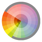
idea #3 Color Systems / Combinations
may pass unnoticed when pleasing, yet offend dramatically when compositions seem to clash. One outcome we seek in the final form or composition, is a successful use of color.
We determine whether or not we are successful by critically assessing the visual balance and harmony of the final composition—balance and harmony are achieved by the visual contrast that exists between color combinations. Planning a successful color combination begins with the investigation, and understanding, of color relationships.
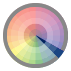
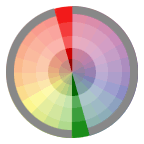
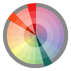
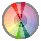
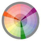
Using a color wheel and a template, the relationships between colors are easy to identify.
Monochromatic Relationship Colors that are shade or tint variations of the same hue.
Complementary Relationship Those colors across from each other on a color wheel.
Split-Complementary Relationship One hue plus two others equally spaced from its complement.
Double-Complementary Relationship Two complementary color sets; the distance between selected complementary pairs will effect the overall contrast of the final composition.
Analogous Relationship Those colors located adjacent to each other on a color wheel.
Triad Relationship Three hues equally positioned on a color wheel.
This is also another quick sketch of what I had in mind when using the color system with typography.


